How Harry Beck revolutionised the Tube map
Harry Beck is famous for creating the modern London Underground map in 1933. Considered too radical at the time, Beck’s diagram became a design icon used by metros all over the world.
1933
-
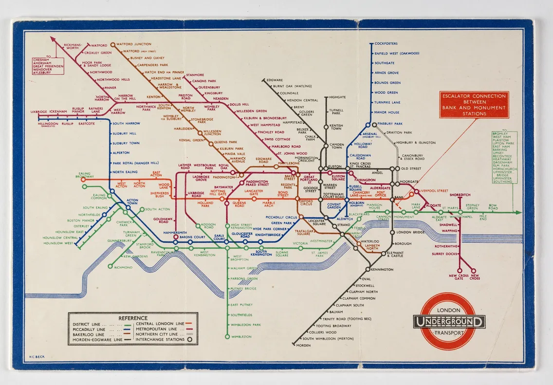
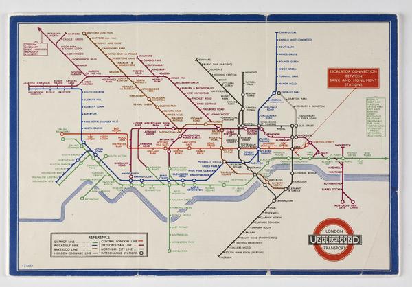
A 1935 map of London's Underground railways, designed by Harry Beck
The skill of simplicity
London’s modern-day Tube map could have been a big sprawling mess if it weren’t for the genius of Harry Beck.
In the early 1930s, Beck redesigned the Underground map in his spare time. The result was radical for its day. He mapped Tube lines using geographically distorted straight lines, which didn’t represent the true shape of the network’s tunnels under the city. It’s what makes Beck’s work technically a diagram, rather than a map.
Beck’s design was adopted by London Underground after some hesitation and eventually became the blueprint for metro designs around the world. But Beck didn’t get much widespread recognition for his work until after his death in 1974.
Today, every Tube map is printed and published with the words: “This diagram is an evolution of the original design conceived in 1931 by Harry Beck.” One of his 1930s designs is in our collection.
What did London’s early Tube maps look like?
The world’s first underground railway, the Metropolitan Railway, was opened by the Metropolitan Railway Company in London in 1863. Different companies ran the new lines that were added to the city’s growing underground network. And each company had their own map.
It wasn’t until 1908 that multiple Tube lines were first brought together on a map. The Tube companies agreed to promote their underground railways together under the ‘Underground’ brand.
-
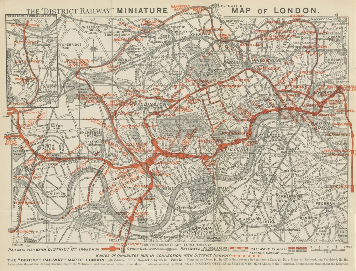
The District Railway miniature map of London, from Cook’s Handbook for London, 1897 edition.
These early maps have some similarities to our modern map. The lines were colour-coded – and some, like the Bakerloo and District, have the same colours today. However, these lines followed the path of the Tube lines in true form. It’s as if the map is an X-ray of London, showing precisely how the railways ran underneath key roads and landmarks.
As the London Underground expanded, so did the area a Tube map needed to cover. This created a problem for geographic maps. How could you accurately show the Tube network to scale, but also make it fit in someone’s pocket? These designs were sprawling and difficult to follow – particularly in tightly packed central London.
Over time, early map designs were simplified. Central London was distorted and made bigger. The street map with road names faded or disappeared completely. Lines were straightened out. But it was Beck who really rolled in the Tube map revolution.
Who was Harry Beck?
Londoner Harry Beck (born Henry Beck) started working for London Underground in 1925. He took a job as a junior draughtsman, creating technical drawings for the signal engineers’ office.
Beck spent the next six years in and out of work. The persisting problem of the Tube map design continued to puzzle him. In his spare time, he worked on a new diagram, rather than map, of the Tube network. This was probably inspired by the electrical circuit diagrams he designed in his old job. In 1931, he had a finished product ready to present to London Underground.
“a better map than any we have had so far”
Frank Pick
Beck’s ‘radical’ design
Beck didn’t bother with making his map geographically accurate. Instead, he created a diagram that made the connections and interchanges between Tube lines and stations clearer to see.
He stuck to horizontal, vertical and 45-degree lines joined together with tight curves, as you’d find on electrical circuit diagrams. This made the map easier to use and reduced the network’s complexity. He also made the central London area much larger in scale, so station names were easier to read. The result was neat, efficient and quite nice to look at.
-
This 1935 map is an early example of Beck’s practical design.
London Underground rejected his design at first, considering it too ‘radical’. But they agreed to a trial of his idea in 1932 and asked the public for feedback. Clearly, it was a success. Beck’s design was accepted and went into print in 1933.
That same year, London Transport was established to take control of all local public transport in London, including the London Underground. Frank Pick, chief executive and vice chairman of London Transport, said Beck’s design was “a better map than any we have had so far”.
Beck was made the principal designer of London’s Tube map, a role he held until 1959.
How Beck’s map evolved
Beck transferred copyright of his map to London Transport. However, he claimed they’d come to an understanding that he’d be consulted on any alterations. Beck felt like he owned the design – and in many ways, he did – but management often didn’t agree. The board tinkered with the map and sometimes got other designers involved.
In 1960, Harold Hutchinson took over from Beck as principal designer and came up with a new map. This move hurt Beck. Hutchinson’s sharp, angular map featured squares marking National Rail interchanges. It was unpopular, lacking the elegance of Beck’s design.
Four years later, Paul Garbutt brought the Tube map back closer in line with Beck’s design principles.
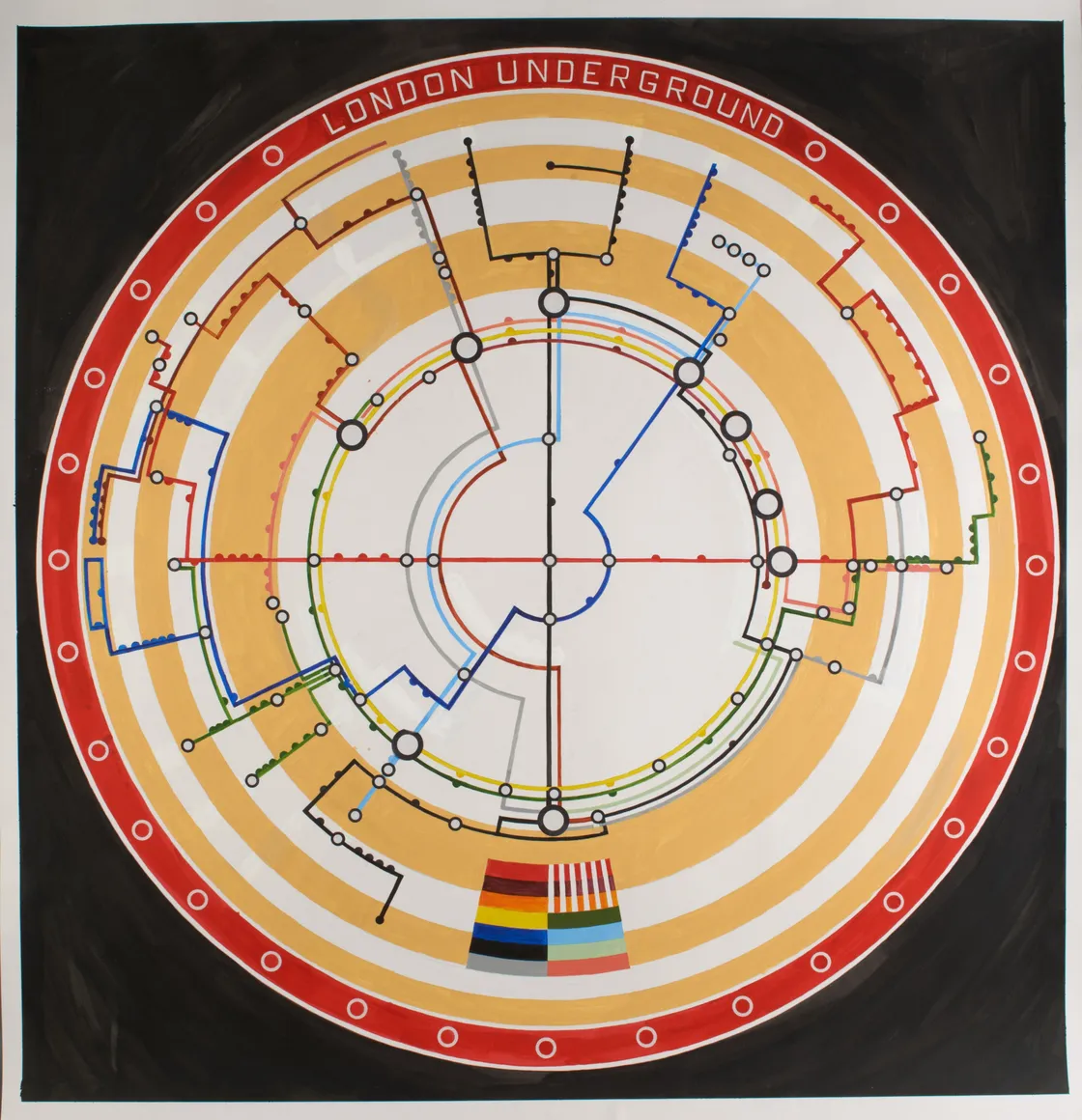
In 2003, artist Adam Dant recreated the Tube map in which the Circle line is actually a circle.
Why we celebrate Beck today
Beck died in 1974 and remained relatively unknown for years. He began to get widespread recognition after his friend, the graphic designer Ken Garland, published a book called Mr Beck’s Underground Map, which sparked a BBC documentary.
We still see Beck’s original design in our Tube map today. It’s a testament to his diagram’s flexibility that it can adapt to a complex and ever-expanding transport network. The Jubilee line, Docklands Light Railway and Elizabeth line have all been added in the decades since, but the design principles remain the same.
Tags
-
Printed Ephemera
-
Paintings, Prints & Drawings
-
-